Aro Systems
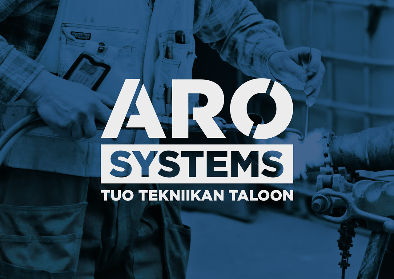
Aro Systems was formed when three Aro businesses merged into one HVAC, construction, and renovation company. The new identity needed to bring the company together under one brand while respecting its family-owned heritage and existing recognition.
I developed the branding concept and visual identity for the newly formed company. The direction built on the company’s existing blue heritage while introducing a stronger, more contemporary visual language inspired by construction sites, skilled hands, materials, and the physical forces of the work.
The concept combined a rugged but precise tone: fire, water, wood, earth, and metal shaped into something functional and lasting. The logo and typography drew from architectural clarity, using geometry, symmetry, sharp edges, straight angles, and circular forms to communicate structure and reliability.
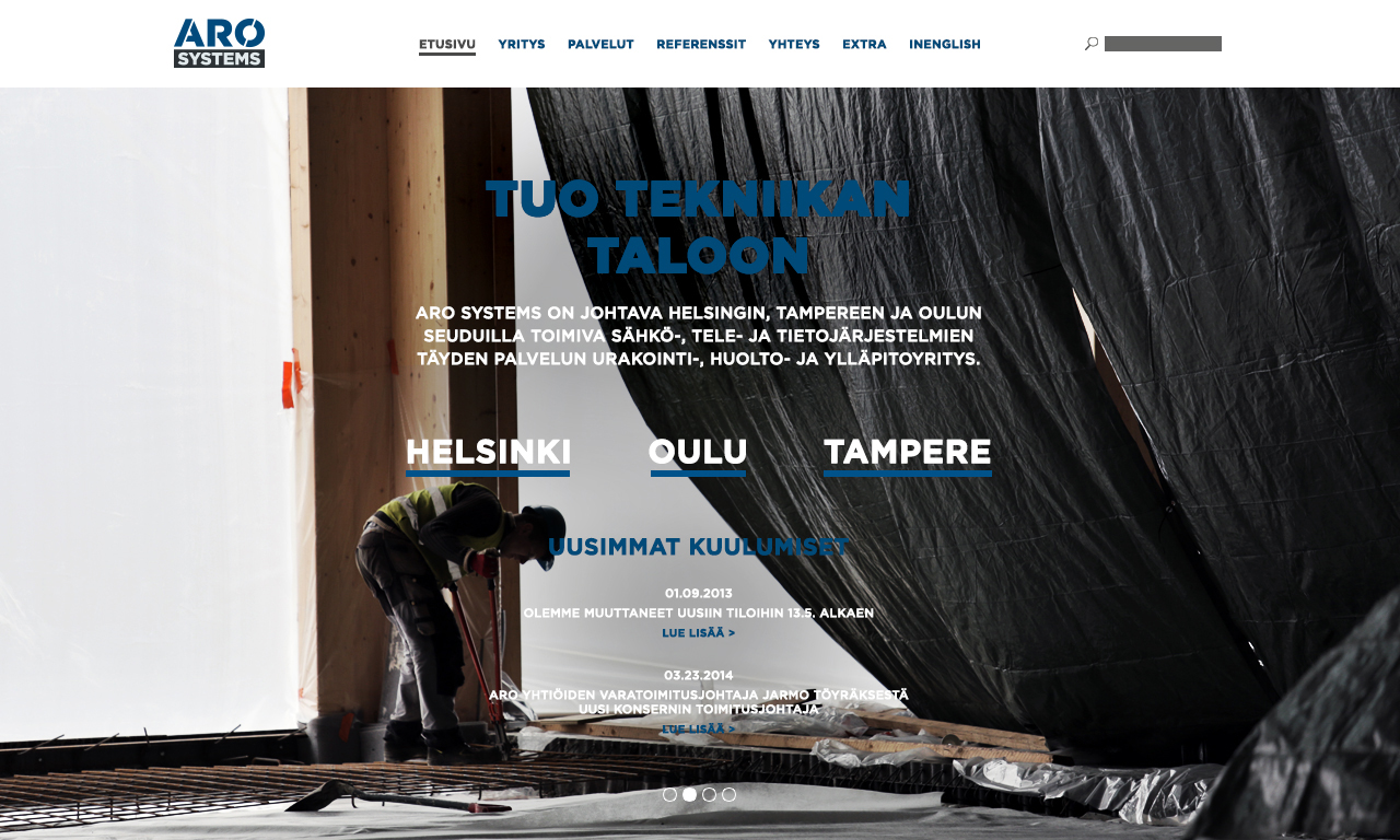
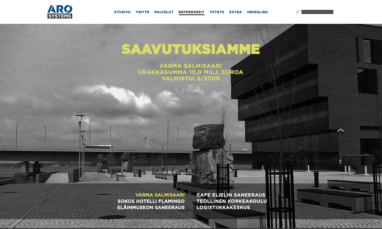
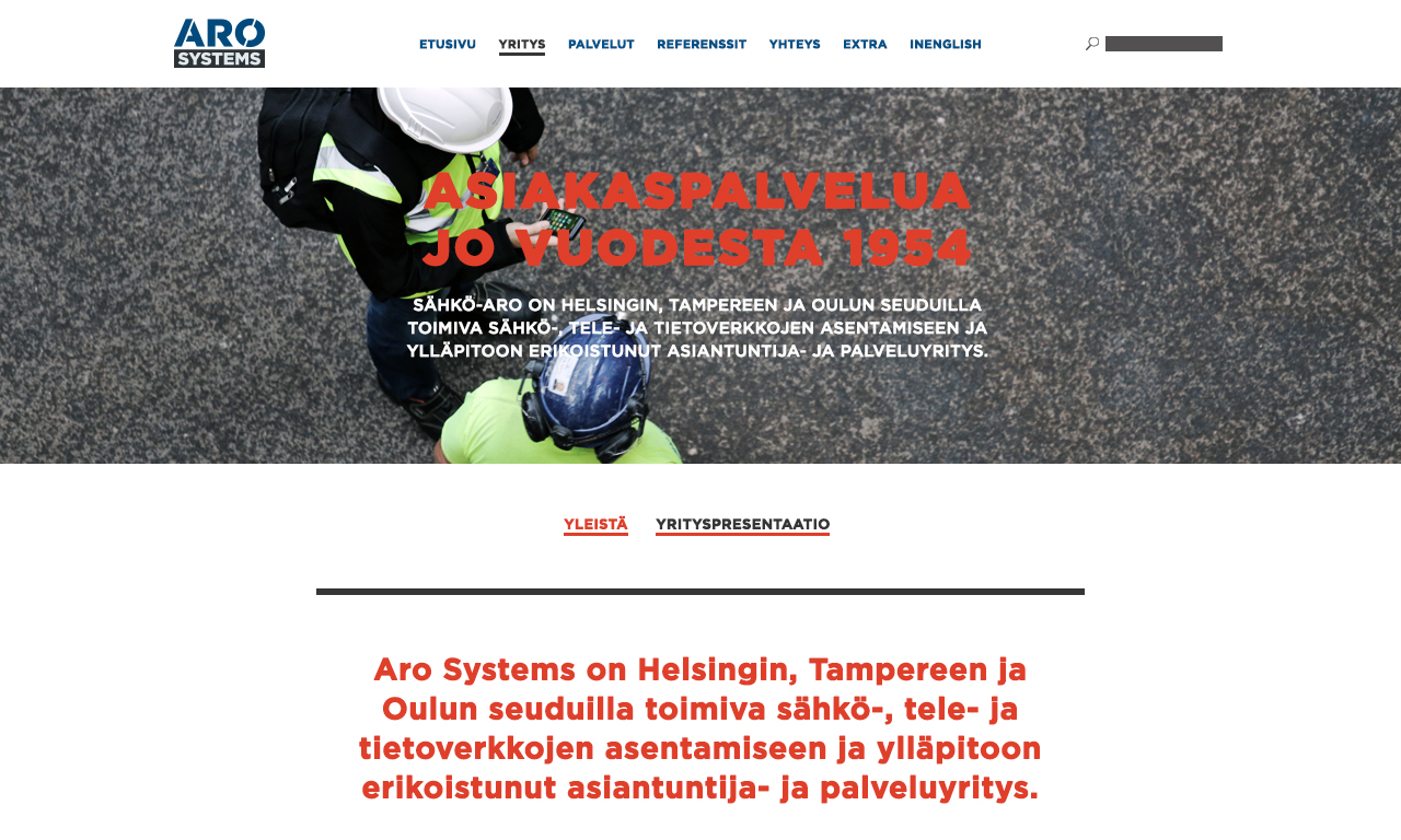
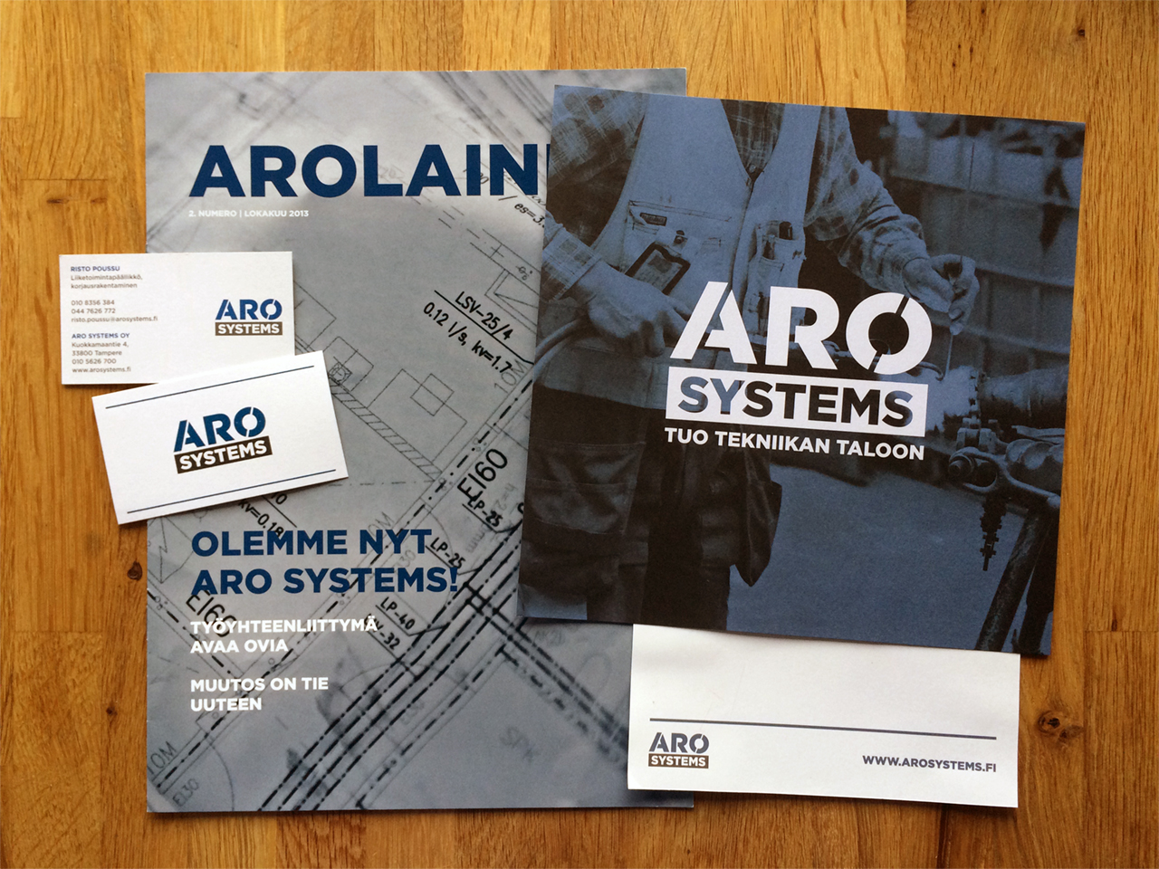
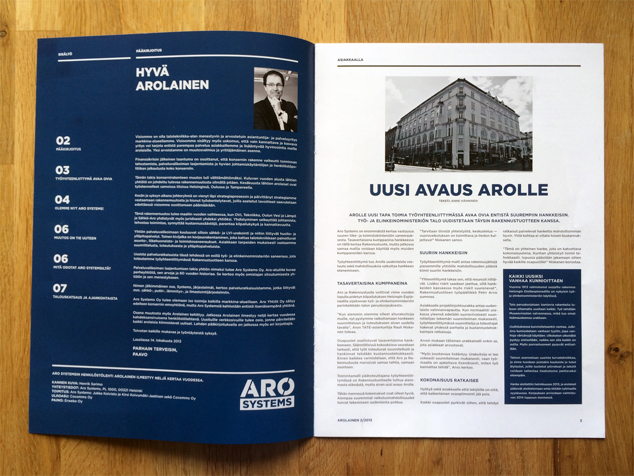
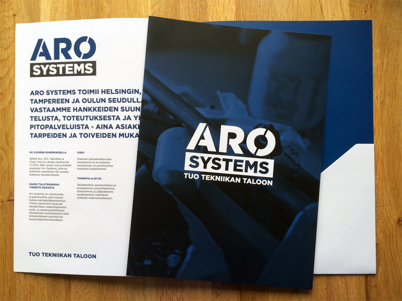
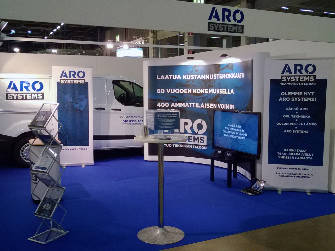
The final identity extended into photography, stationery, print, and web design. I wanted the visuals to capture both the toughness of construction work and the energy of people using skill, tools, and modern techniques to build something better.
Conceptual process
The logo and typography are inspired by bold, clear, minimalist architecture. Key descriptors: geometry, symmetry, sharp edges, straight angles, and circular forms.
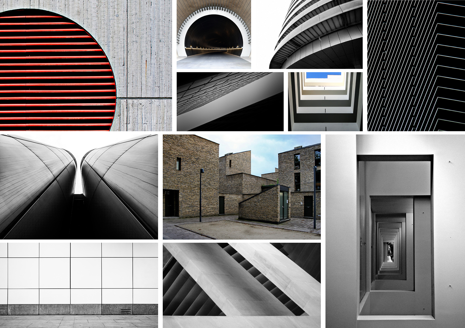
Visual language moodboard
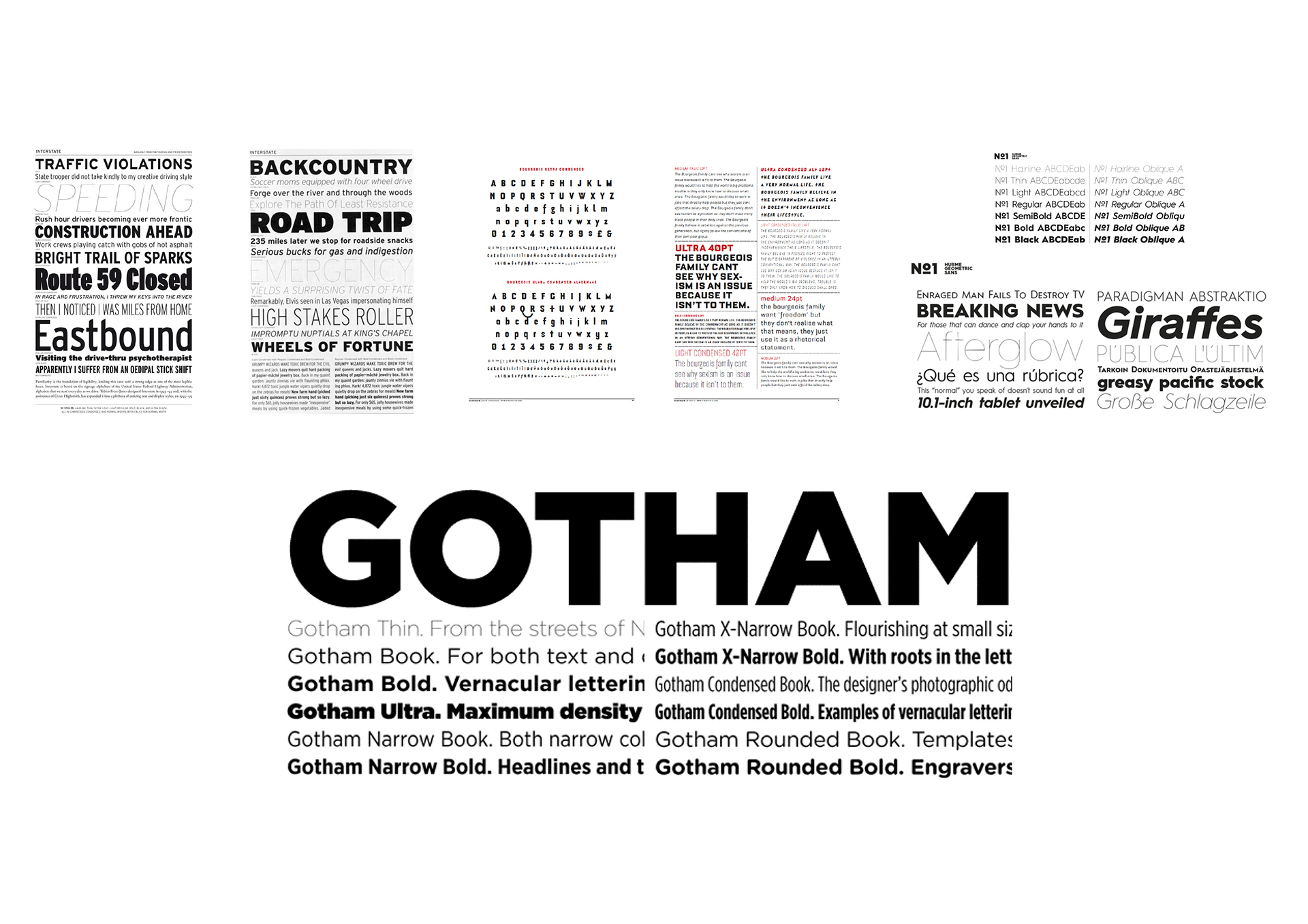
Typography references
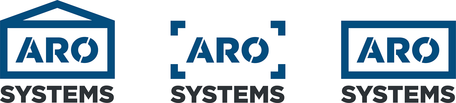
Some logo proposals
Final logo
Construction is defined by ruggedness, yet it’s also vibrant and dynamic. I wanted not only to draw the colors from these elements, but also to capture the excitement and power of harnessing fire, metal, water, and earth in the photography.
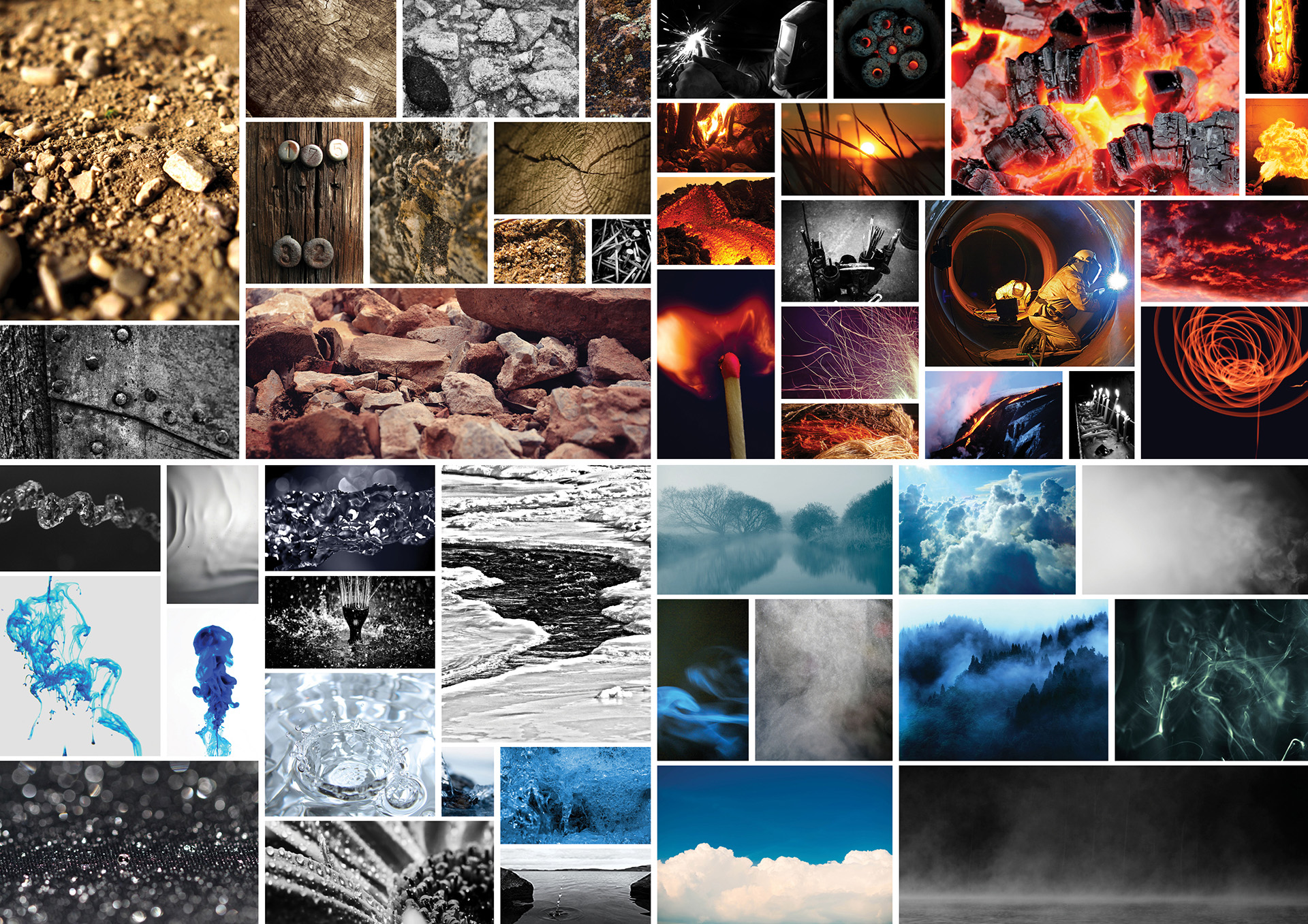
Colors and atmosphere moodboard

Final color palette
Stationery, magazine and print design
Web design