Kaiken Publishing Ltd.
Who:
Kaiken Publishing Ltd.
What:
Branding, art direction and design of the visual identity and various stationery, web concepts
When:
2016
Intro
The Rovio spin-off Kaiken Publishing Ltd. (later Kaiken Entertainment and now Ferly) was a creative publishing agency focusing on building original stories and brands.
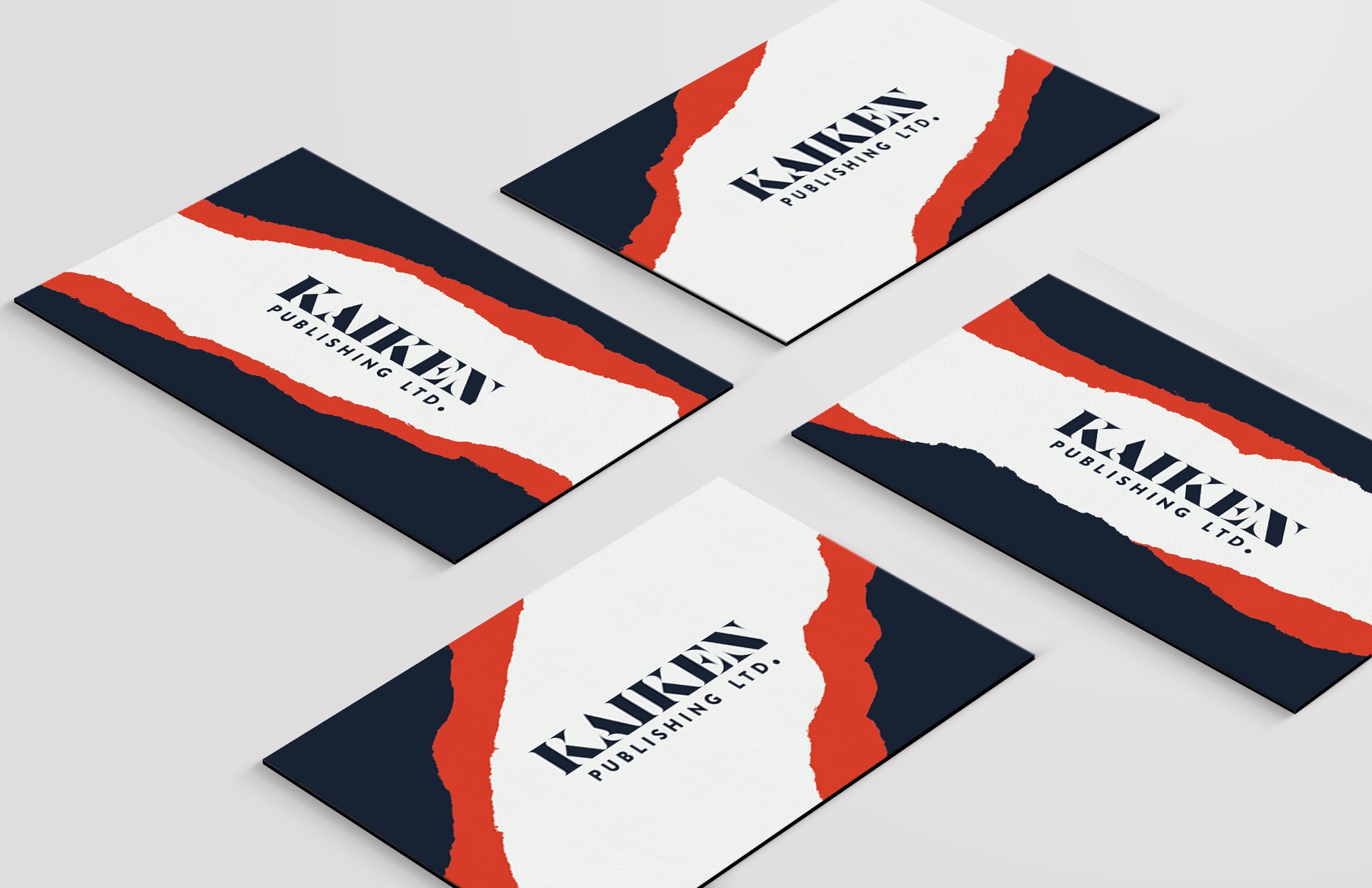
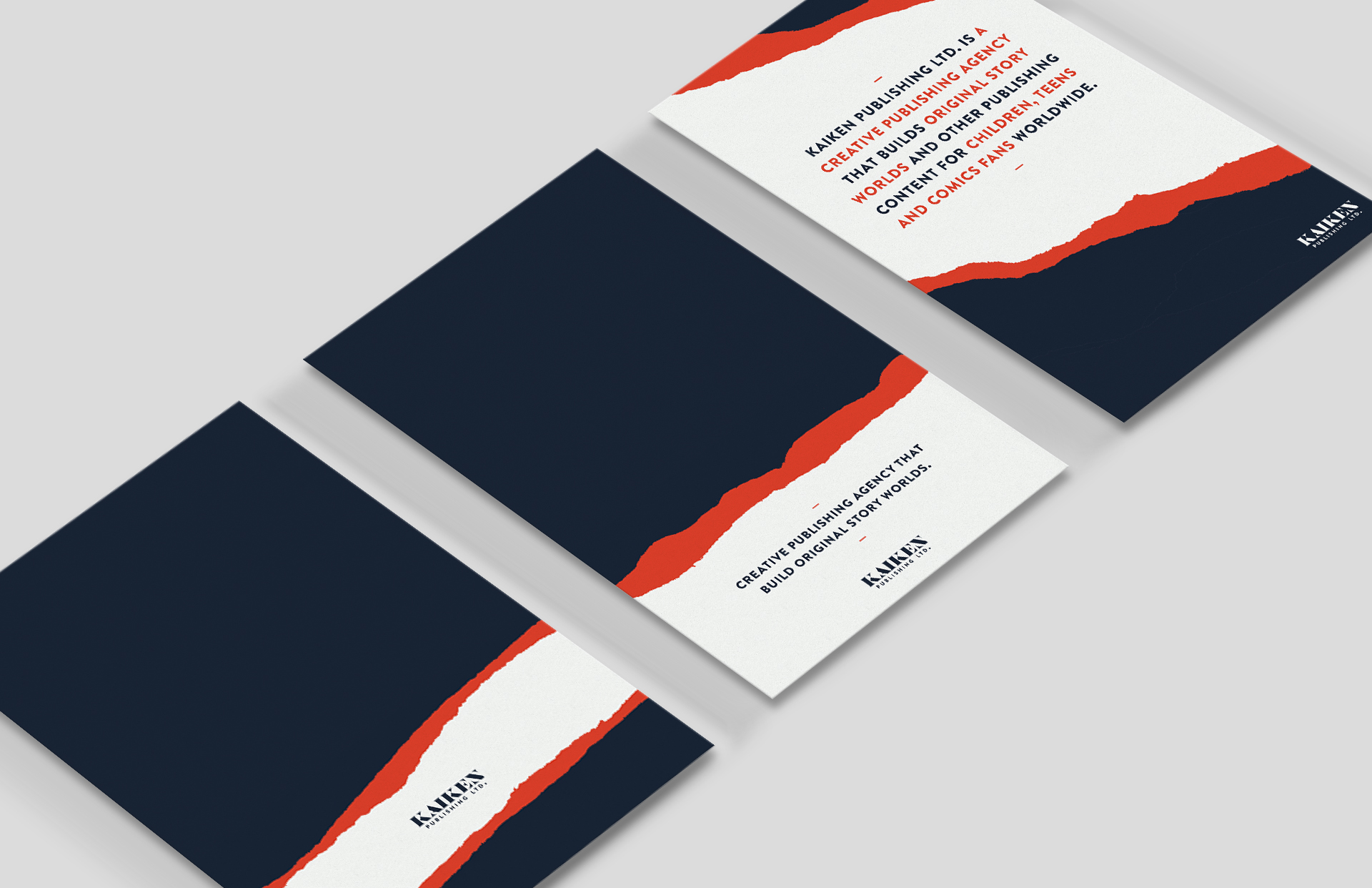
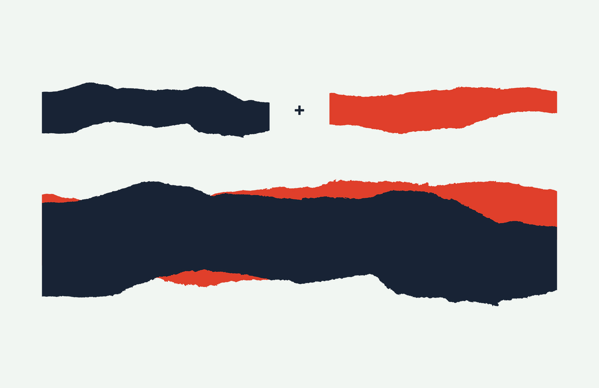
My task was to create the visual identity. Since it was solely a publishing entity back then I presented a concept about peeling back or tearing through an endless stack of layers. A little bit like through pages of a book communicating the idea that there is always another page to read, another adventure underneath to explore.
I ended up creating a simple generative system that outputs endless combinations of flexible graphical elements that work in any media. This way the brand always feels new and dynamic despite the otherwise minimal look.
The logo reflects literary tradition with ornate serifs and curves, yet is quite modern in its adventurous build. The headline and body font serve as juxtaposition for the boldness of the logo.

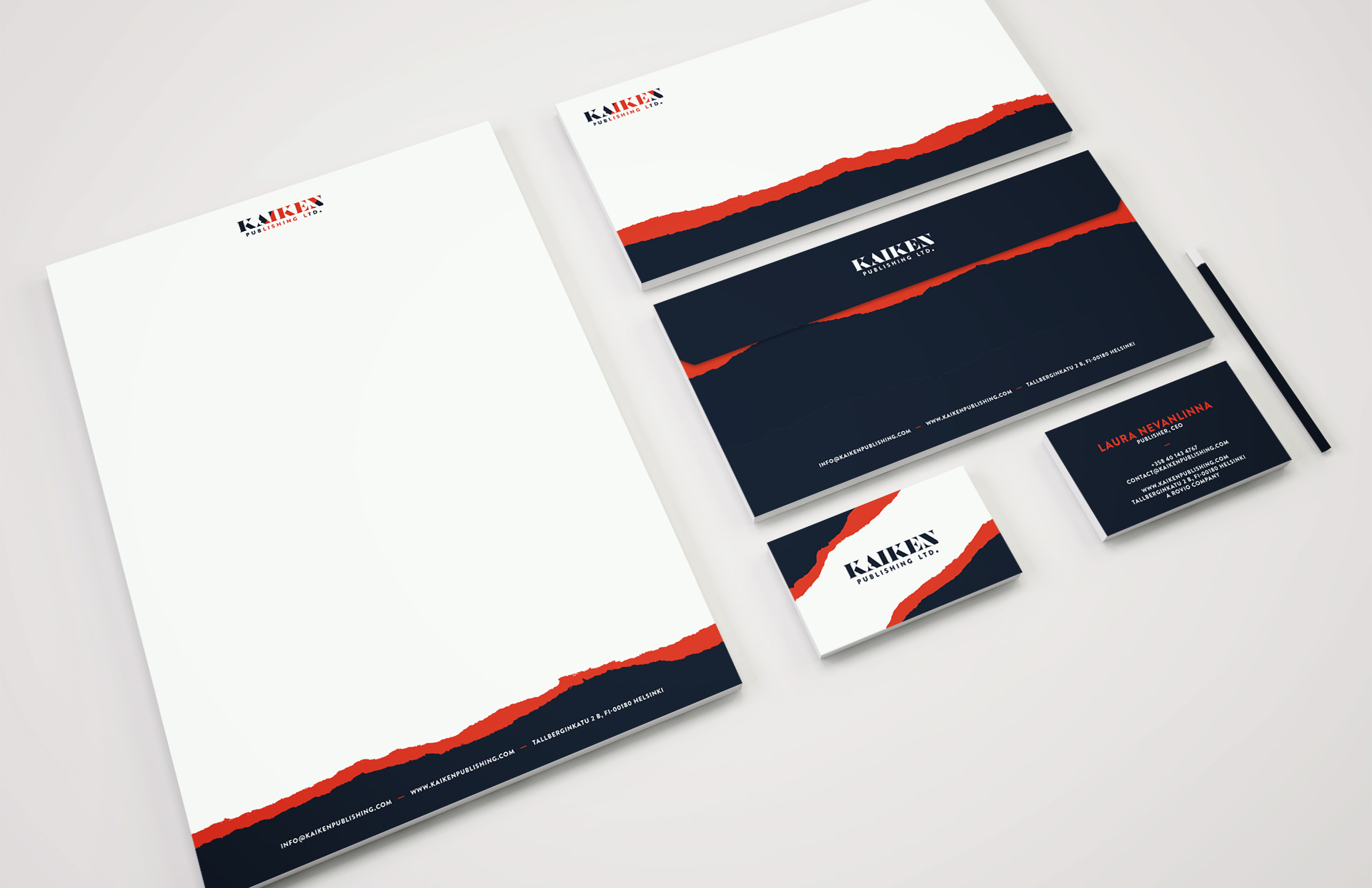
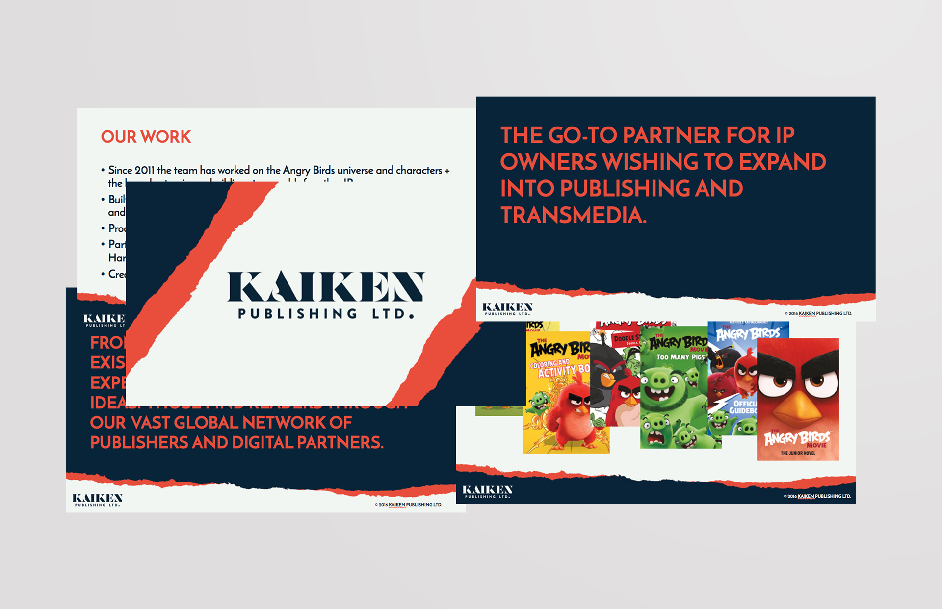
Stationery, business card and presentation template designs
